Duration:
2-day agile sprint in June 2019
Team: NIL (Solo project)
Role: Interaction Designer. Concept direction; Design research; Rapid prototyping, testing, production; Graphic design.
Objective: Redesign the gov.sg site to better serve citizens
Gov.sg is the first-stop portal for citizens to find out information about government services. Some challenges of the existing platform includes:
-
Traffic to Gov.sg is low
-
Citizens increasingly use search engines to look for and access services directly with the specific government agency
-
Competing with agencies that are already redesigning their own sites to better serve their own customers.
Design Process

Discover what truly matters to people, quickly and effectively.
With the time frame given, I decided to interview people off the streets, and send out surveys across my social circle, with the intention of finding out what users of different demographics and from diverse walks of life will look for when they use an official state-owned site. Here are some of the key highlighted insights that I found out:
When asked about their initial impression upon entering the current gov.sg:
“这个做什么的?用了是不是有 NTUC discount?”
"I don't really know what it is for.”
“Too corporate looking.”
“Not very mobile friendly"
“formal looking, not very sure it’s purpose because it doesn’t seem to belong to any particular ministry. the headings in the navigation menu are pretty strange, seems pretty randomly organised.”
“Quite boring. On the mobile site its pretty useless because there doesn't seem to be much clear directions on what its actually for.”
“No particular impression, was just looking for the menu tab”
If they could change something about gov.sg, what will it be?
“information is too broad. No specific focus on topics/what it provides. Or maybe it's just the lack of organization.”
“More personalised but professional looking”
“Easier to navigate, especially on smart devices”
“More news on the current agenda of the government and developments of upcoming projects”
“make it look more fun and friendly, maybe a bit more modern looking? a short intro about what the website is for in the home page?”
“Be more clear on its functions and include tabs on what things gov.sg can provide.”
What would they want to see in gov.sg in the future?
“maybe create a subcategory for each topic. like under housing could split into > loans/types of housing/ types etc.”
“Updates on policies changes and speeches from ministers”
“More news”
“Open forum for citizens to voice their opinions”
“not too sure... depends on what the government is trying to use it for”
“One stop shop for all administrative needs regarding anything Singaporean. Links to places like HDB and Army, ways to vote, perhaps a clear overview of the political scene in Singapore. Possibly showing the current/proposed policies being discussed right now and seeking people's opinions, allowing us to be more engaged in politics.”
“career, national events etc”


Defining two fascinating categories of users
From the insights gathered, I mapped out two categories of users who enters gov.sg, which is interestingly parallel to how people shop at the supermarket. The purposeful users can also be broken down to many archetypes, from the curious Auntie, to the Newly-wedded, the Retired Businessman to the Expat.


Defining pain points and establishing a redesigning approach
Looking deeper into the insights gathered from the people I talked to, there were three main pain points of the current status quo of gov.sg that was frequently brought up:
-
There was an unclear objective for what the website is truly for. This is especially so for first-time visitors - to them, the purpose seem to overlap with other agencies, often repeating the same information.
-
With that being said, it leads to an overwhelming amount of information. Visitors find it extremely tedious to find the necessary information, liking it finding a needle out of a haystack.
-
It is not mobile-friendly. Its responsive web design is preliminary and simply not intuitive, this drives off many visitors, leading them to enter and use other sources of information from sister agencies or even independent news channels.
Hence for this agile sprint, I wanted to set a strong foundation to develop a cleaner and more focused user flow that achieves these three goals:
-
A clearer objective that sets gov.sg apart from other websites
-
For the purposeful user, we want to provide them with the right information at the right time.
For the chance user, we want to take advantage of the opportunity to inform. -
Taking a strong mobile-first approach, due to its efficacy and ability to keep content laser-focused, short and sweet.


Developing user flow and progressing towards wireframes
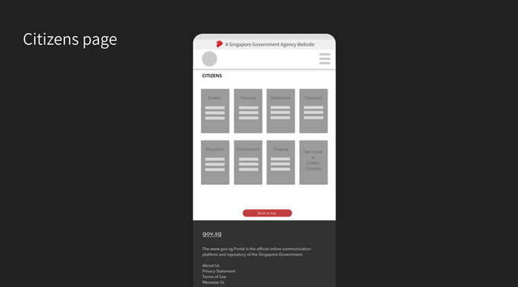
I knew the aim was to drive as much traction as possible to the Home page and the Citizens page, such that users can navigate to the different pathways relevant to them.
Some design drivers that was important to keep in mind was:
-
Mobile-first design
-
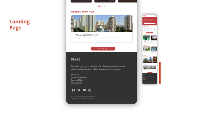
From top to bottom (Priority) : Landing page to act as a centralised summary with different sections in decreasing priority
-
From left to right (Breadth): Users can browse the section in a carousel format, going through the content from left to right
-
Design consistency

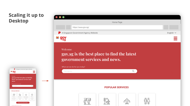
Introducing gov.sg - redesigned.
Welcome to gov.sg, it is the best place to find the latest government services and news. If you have entered the site with an intention in mind, it serves as a compass to connect you to relevant government departments, agencies, and public bodies. If you happen to pass by, you will be able to browse through the most popular news and recent updates that matters to you. gov.sg helps to keep you informed, updated and on top of all things important to your citizenship, from finding affordable housing, understanding the latest masterplans or watch videos on why the lion that Sang Nila Utama saw was a myth! Enjoy your stay!


